Key Takeaways:
- What to include on your speaker web page
- Want to really stand out? Include these key elements.
- Get inspiration with a few of our client samples
- Your website’s speaker page is a work in progress
Meeting planners want to see a speaker page on your website.
Does it effectively showcase your work as a speaker?
Do you even have a web page dedicated to your speaking services?
Whether your speaking page could use some attention, or you have yet to set your page up, let’s get started with a summary of the key elements your speaker web page should highlight.
What to Include on Your Speaker Web Page
Remember the purpose of this all-important web page: it’s basically to “sell” you. It’s your chance to market your professional speaking services to event coordinators, meeting planners, and any other interested party.
Developing a web page doesn’t have to be elaborate, especially if you’re just starting out. Here are our recommendations…
At minimum, your speaker web page should include:
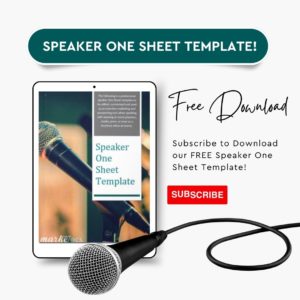
- Your Speaker One Sheet (Don’t have one? Download our free template here.)
- An approx. 100-word bio
- 2-4 speaking topics
- A highlight reel (if you have one)
- Testimonials
- Don’t forget your contact info!
Other elements to consider including on your speaker page, especially as you start landing more engagements:
- A headshot of you
- Videos!
- Media highlights
- Book highlights
- Mentions of past events
- Stats on your reach/impact
- Bios of varying lengths (i.e. 25-, 50-, 150-words & so on)
- A calendar of your upcoming events
Helpful hint: You can create two versions of a speaker web page, each with a specific goal in mind:
- A simplified version that emphasizes sales & promotes your speaking services
- A comprehensive version for meeting planners with every little detail included
Leverage These Elements to Help You Stand Out as a Speaker
Of course it makes sense to include key details like your contact info and a basic bio. You’re basically introducing yourself “virtually” to any number of prospects, like meeting planners and event coordinators.
If you want to attract the attention of these busy meeting planners, incorporating some key components can really help you shine:
- Videos: Do you have a video of yourself speaking on stage? This is a great way to make what you do come alive in the eyes of a meeting planner or other prospect. If not, consider including a brief introductory video of yourself explaining what you do and why you’re passionate about your work.
- Testimonials: They’re king. Period. 94% of consumers report that reading a positive review raises the chances that they’ll engage with a business. Whatever your industry, testimonials provide that vital credibility & trust factor your prospects are looking for as they decide whether or not to hire you.

- Speaker One Sheet: This single page of branded marketing collateral for professional speakers is your opportunity to make a memorable first impression with meeting and event planners. Make yours accessible by including an easy download button or link on your speaker page.
If you don’t have one or yours could use a dusting off, download your speaker one sheet template, free!
Psst, a Bonus Tip: You’ve gone through the process of creating a great speaker page on your website … just make sure it’s easy for prospects to find! Keep the URL simple and remember to include a link to the page in your site navigation menu. Also optimize the page for SEO so search engines can find it too.
A few of Our Favorite Client Samples
If you need some visual inspiration to get your creativity on, check out the following samples from our own clients here at Marketecs…
#1- Endeavor Management/Barbara Stewart, Director: Endeavor Speaker Page
About Endeavor Management: Barbara Stewart teaches audiences how to leverage strengths, communication styles, client relations, and marketing to make working together a rewarding, successful experience.
Ideas to incorporate into your own speaking web page:
- Make sure your copy “speaks” to your intended audience. Notice the use of “you” and “your” statements that make the copy feel both personal and professional.
- Always factor in the overall page layout to create a positive user experience. On Endeavor’s well-organized page, keynote topics are presented in a clean grid-style format, followed by another grid of selected videos.
- Place CTA buttons strategically throughout your page so users can easily click a button to book you.
#2 – Dr. Kathy Obear: Dr. Kathy Obear Speaker Page
About Dr. Obear: For over three decades, Kathy Obear, Ed. D., has been skillfully bridging chasms of inequity and disparity in organizations and businesses starting with the “Alliance For Change”, an organization she founded in 1984.
Ideas to incorporate into your own speaking page:
- Notice how Dr. Obear’s page includes a clear image that greets you immediately upon visiting the page.
- Her titles, a brief introduction and accompanying video follow – make it clear upfront who you are and what you do.
- Everyone loves videos – meeting planners included. So, if you have a video or two showing you in action, include it!
- If you’re an author, highlight your most popular books, like how Dr. Obear’s page summarizes her prominent literary works.
Note: this page is particularly comprehensive, this was intentional based on the audience that would be accessing it.
#3 – Authentic Leadership International/Colleen Slaughter: ALI Speaker Page
About ALI: Led by Founder Colleen Slaughter, Authentic Leadership International is a Leadership Development firm specializing in Executive Coaching and Team Facilitation.
Ideas to incorporate into your own speaking page:
- Make it nice & easy for meeting planners to access the info they need. Note how this page includes bios of varying lengths, clear policies & AV preferences, as well as details on signature presentations.
- Consider adding a “Download” button where appropriate so event coordinators can quickly retrieve exactly what they’re looking for.
- Authentic testimonials carry a lot of power. If possible, add at least 1-3 to show prospects what it’s like to work with you & how your clients/customers have benefited.
#4 – Gilman Patrick, LLC/Patrick Martin: Gilman Patrick Speaker Page
About Gilman Patrick, LLC: Founder Patrick Martin helps bankers make more money by leveraging the power of technology. He specializes in developing and leading transformational initiatives within the banking industry.
Ideas to incorporate into your own speaking web page:
- Do you have strategic partnerships? If so, include the company logos of some of your top alliances as Gilman Patrick has done here.
- Make sure you’re “accessible” – even on your speaking page – by clearly posting key contact detail upfront. Notice the first text you see includes both an email and phone.
- Your speaking page can be more general if you’re open to it – you can state your availability for interviews, articles, podcasts & more. For example: “Request Patrick Martin as the Financial Technology Expert for your next event, interview, article, or podcast.”
Your Speaker’s Web Page is a Work in Progress
If it feels overwhelming to think about building a speaker web page from scratch (or if you know yours could use some sprucing up), no worries.
You don’t need every element we named here to get started – even a basic page is a great way to put your name out there.
As you evolve and grow, so will your speaking page. Like most anything in business, think of it as a work in progress.
Need help designing an impactful speaker web page that showcases your expertise? We can help! Contact Marketecs today to brainstorm with us.


